
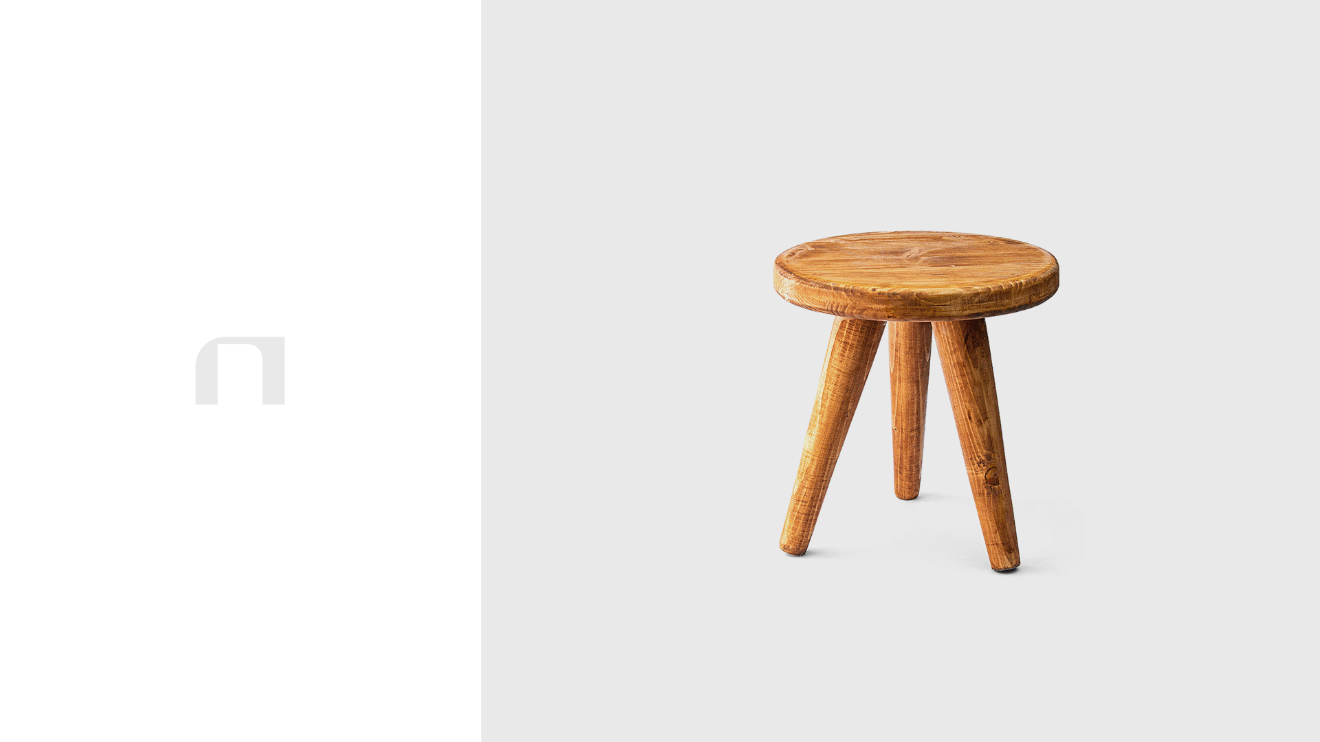
Autohton believes in the naturalness of being, both when it comes to us and when it comes to the things we choose for our home. It's about the peace of being, and we can identify that in a beautiful object, that we choose to look at every day.
Industry
➝ Consumer Goods
Region
➝ Romania
Delivery
➝ Branding
➝ VerbalIdentity
➝ Visual Identity
➝ Packaging Design
➝ Brand Collaterals
➝ Art Direction
Team
➝ Paul Vîrlan
➝ Ștefana Gabor-Stoica
Seeing life in an object
We understand what a real object, which comes from real needs, means. An object that has to tell you things, which you will want to say further. An object that has taken the best from the thoughts and hands of the one who created it and that brings good to your home.
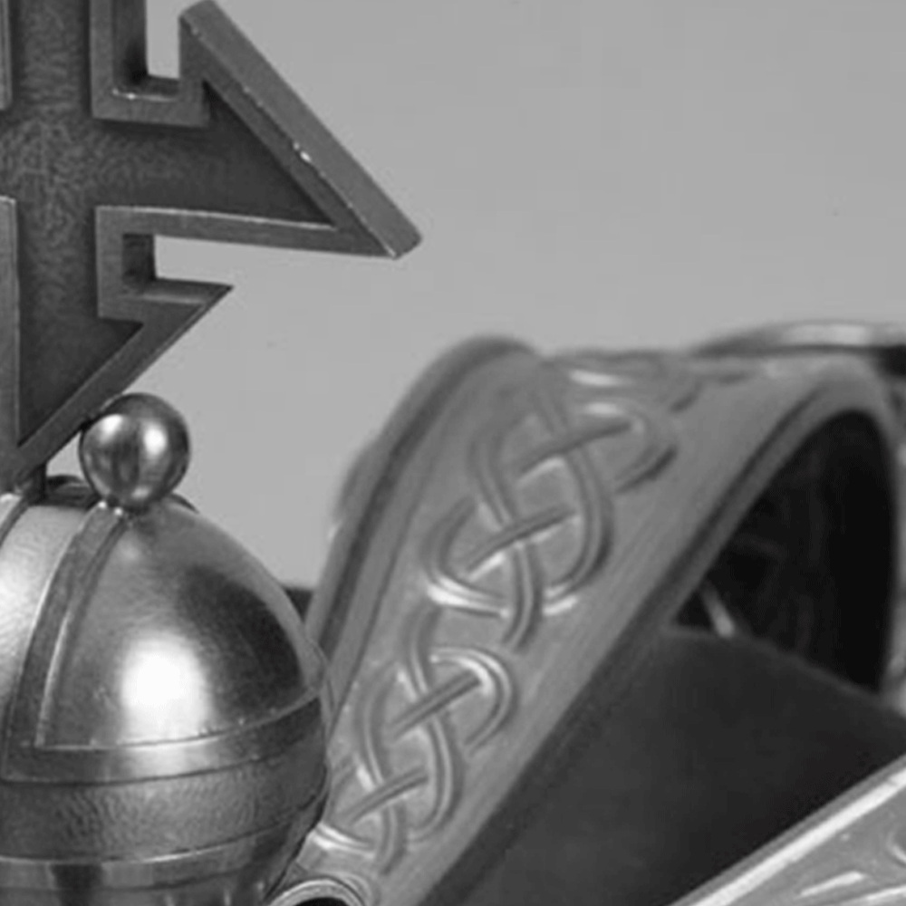
There is a visual understanding between Romanian royal elegance and the simplicity of a functional object, through the meeting of neo-Brancovian motifs with neo-Romanian ones.
The Logotype
The graphic language restyles angular lines and circular shapes identified in the royal crown of Queen Mary, drawn by Costin Petrescu, the painter of the Royal Court, in the early 1920s. These details contribute to the steadfastness and elegance of Autohton letters.


The logomark
The symbol was designed to be used as a signature. It is not part of the logo but can be used in conjunction with it.


Visual Identity
Autohton is about objects created by settled people – objects that are as natural now, today, as they were at some point decades or hundreds of years ago. Objects that invite you to come back to you.


Some icons were designed according to the same graphic language that inspired the logo. They describe categories of objects, characteristics, or information about objects.


%20(2).jpg)
.jpg)


Packaging


.jpg)
.jpg)
We have wood, metal, earth, and stone in the country, and these resources are enough to be careful about what objects we invite into our lives. So Autohton will always look for objects whose sustainability has always been there, in its archaic simplicity.
Brand Typography


.jpg)
.jpg)
Autohton identifies authentic products, lesser known but with enormous potential for development, created by people with their hands and techniques, in their workshops.
The raw material used is natural, biodegradable, or recycled. The impact of production on the environment is minimal. We promote the importance of controlled origin.
