top of page

BUffER creates supplement gummies that support your habits, with the gummy itself becoming the new habit. Most supplement gummies look like medicine, and taking them feels like a chore. We changed that! A gummy that sits next to your coffee or near a cocktail turns a supplement into a small daily habit, taken casually and with joy. A friendly look, a fun, confident voice, and bold colors replace the clinical shelf.
Industry
➝ Food & Beverage
Region
➝ USA
Delivery
➝ Strategy
➝ Branding
➝ Visual Identity
➝ Packaging
Team
➝ Paul Vîrlan
The story
behind the Logo & the Name
BUffER lives in that moment: between your third cocktail and your 11 am meeting, between the shaking hand that replies to an email.
A name about the space between two things needed a mark that holds space, so the wordmark follows the same logic. It keeps its strength at the edges and its calm in the middle. The two lowercase f’s sit in the middle, quieter, a buffer inside the word. They are the only repeated letters in the name, a pair that never separates, like the two gummies taken together. The period closes the name like a decision made, calmly and with nothing left to explain.

Packaging Architecture
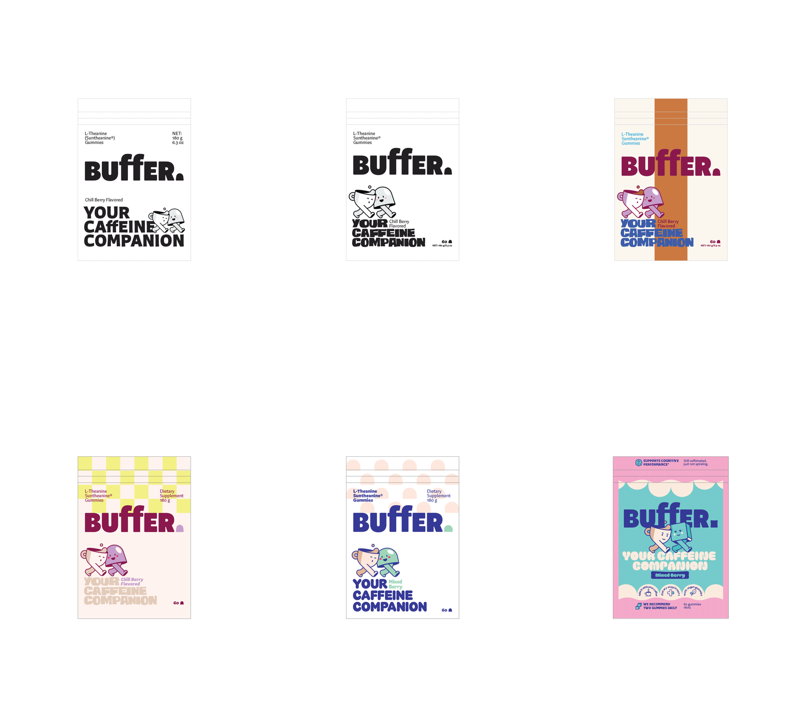
Everything in the BUffER. range is built around one idea: Your habit companion. Three SKUs, each designed around a function, each with its own companion. The gummy changes color with the flavor, so you recognize your companion by its color before you read a word on the pack. One calm but bold pink holds the range together. The structure is fixed, the companions rotate, and there is room for as many new companions as an easy, good life needs.


Visual Identity
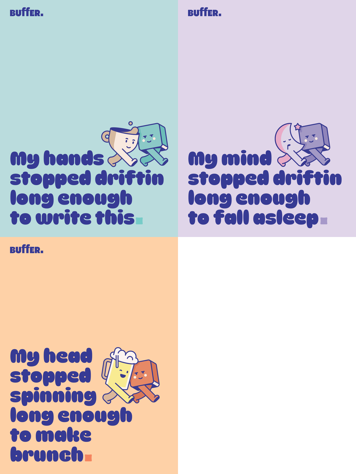
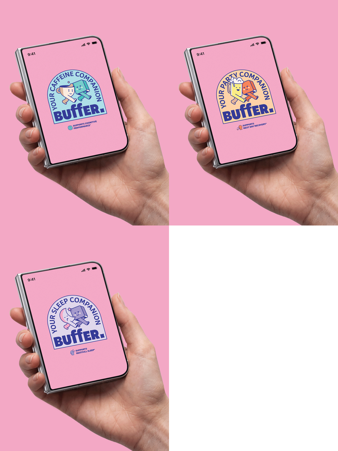
Confident and fun, adaptable to each companion, each flavor, and each new situation that comes up in your life. The soft jelly feeling starts in the logo, continues in the rounded corners of the illustrations, and ends in the typography and colors.


bottom of page