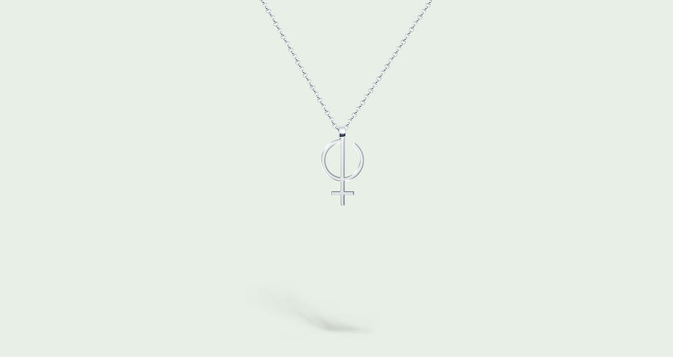
Emmeline is a Romanian jewelry brand created to connect women with the e-commerce fashion industry. The logo conveys the power and independence of women and is designed as a piece of minimalist silver jewelry.
Industry
➝ Consumer Goods
Region
➝ Romania
Delivery
➝ Branding
➝ Visual Identity
➝ Packaging Design
Team
➝ Paul Vîrlan
The Challenge
The jewelry and fashion e-commerce space is crowded with brands that look alike: generic elegance, predictable serif fonts, and the same soft palette repeated endlessly. Emmeline needed to stand out as a platform dedicated to jewelry creators and enthusiasts, built around a genuine celebration of femininity rather than a surface-level aesthetic.
The Approach
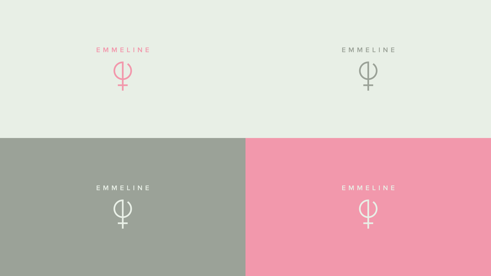
The brand identity was built around a single, powerful idea: the logo itself is a piece of jewelry. The symbol makes a direct visual reference to the name Emmeline and to femininity, designed with the same precision and intentionality as the pieces the platform celebrates. Minimal, confident, and immediately recognizable, it works as a logo, a seal, and a signature across digital and physical touchpoints.
The tagline Crafting Beauty distills the brand's entire purpose into two words: a nod to the handmade nature of jewelry and to the act of building something beautiful, whether a piece of jewelry or a personal style.
The visual system was developed to feel native to the e-commerce environment: clean enough for product photography, distinctive enough to hold its own in a crowded feed.
The Result
A brand identity that embodies Emmeline. The symbol functions as both a logo and a piece of design in its own right, giving the platform a visual anchor that resonates with every creator and collector who discovers it.