
Born from the lack of diversity in products for textured hair, SHYNE was created to celebrate individuality through quality, simplicity, and purpose.
Industry
➝ Consumer Goods
Region
➝ England
Delivery
➝ Branding
➝ Visual Identity
➝ Packaging
➝ Product Design
Team
➝ Paul Vîrlan
➝ Alvin Mills
➝ Aukarapong Sapsantitikul
➝ Chayaporn Wangchana
Logo
The SHYNE logo reflects the brand’s commitment to high performance, authenticity, and inclusivity.
The logotype is crafted with precision and technical elegance, drawing inspiration from diamond craftsmanship, a symbol of quality, clarity, and refined beauty. Complementing it, the logomark embodies the message “we are stronger together”, visually representing the brand’s foundation in community and collective strength. Together, they express SHYNE’s purpose: confidence through simplicity and unity through design.


Brilliance begins at the crown of the diamond. Cut between 32° and 35°, this delicate angle captures perfect balance between elegance and intensity, where craftsmanship meets pure radiance.


The new logo, inspired by the precision of a perfectly cut diamond, reveals a shield symbolizing protection and a star representing self-confidence.


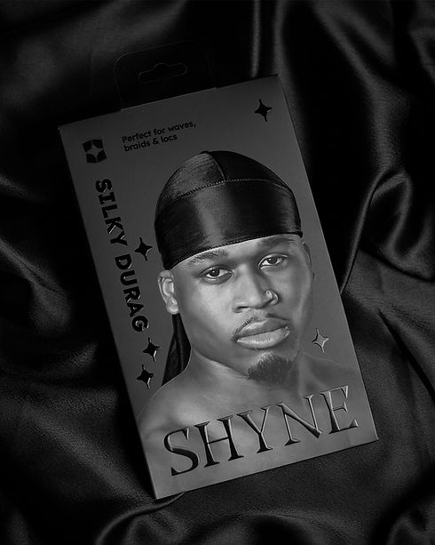
Packaging Architecture
The SHYNE packaging system was designed to bring clarity and cohesion across a diverse range of products while reflecting the brand’s refined, purposeful aesthetic. The structure is built around three main categories: Headwear, Styling Products, and Styling Tools, each with a distinct yet unified visual language.

Headwear
Headwear embodies clarity and functionality, expressed through tactile materials, a wide range of colors, and subtle finishes inspired by diamond facets.


Styling Tools &
Styling Products
Styling Categories highlight performance and precision, using clean forms, structured typography, and subtle finishes inspired by the diamond facets product line to shine with its own identity.


Together, these categories form a cohesive packaging architecture that reinforces SHYNE’s values: simplicity, quality, and empowerment.


Branded gifts highlighting the star, a key graphic element in the brand’s visual language.
“We began the rebranding process with a two-step strategy: first, we tested a subtle update to the old in-house packaging, and then we reworked the name, positioning, logo, and the entire packaging architecture. I can confidently say it was the best decision we ever made, and the improvement was remarkable. The process was worth the wait, resulting in a brand that exceeded my expectations and received incredible feedback from our entire community.”
Alvin Mills

