
Güüd is a smart and healthy choice for both you and the Earth.
As the expression goes, “good is not enough”, that’s why we bring you Güüd! The Scandinavian brand offers products made by Ecolean in convenient packaging for your thirst and hunger.
Industry
➝ Food and Beverage
Region
➝ Sweden
Delivery
➝ Branding
➝ Visual Identity
Team
➝ Paul Vîrlan
➝ Sylvain Racine
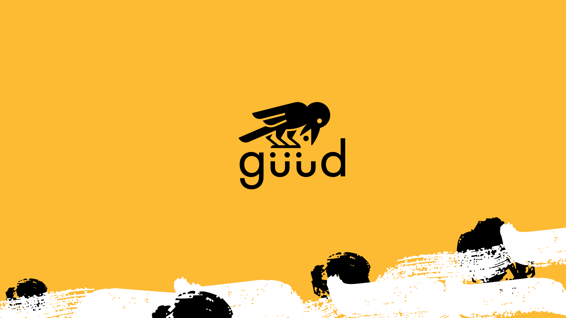
Logo
The logo combines traditional tales from different cultures:
Europe: “The thirsty crow story”
China: “Yangwu, the sun crow”
Japan: “Yatagarasu”
Korea: “Samjogo”
This fusion talks about brand vision and about multidisciplinary thinking in creating products. The symbol presents a cute crow companion, doing what it needs to achieve what he wants.
I need! I work! I get!


Packaging
A very thirsty crow felt as if he must die of thirst. Luckily, he found a pitcher with little juice, but could not reach it. Then, an idea came to him. He picked up small pebbles and dropped them one by one into the pitcher. The juice rise higher until it was near enough so he could drink it and save his life.


Packaging 200ml x 24

Visual Identity


Brand Merchandise


