
Limin is a nature-inspired packaging and branding project built around the rhythm of growth, rest, and renewal. Designed around the quiet discipline of the pear, the packaging pairs earthy, soft colors with refined details like gold foil accents, reflecting a community that lives close to nature without giving up a sense of elevated craft.
Industry
➝ Food & Beverage
Region
➝ Swedem, China
Delivery
➝ Strategy
➝ Branding
➝ Visual Identity
➝ Packaging
➝ Advertising
➝ Product Design
Team
➝ Paul Vîrlan
➝ Jingya Zhao
The story
behind the Logo
Limin draws deeply from The Analects of Confucius and its teaching on etiquette: to see, hear, speak, and act only in proper ways. For thousands of years, this principle of self-discipline has shaped how people move through the world with intention.
Limin reframes that wisdom for modern life. Etiquette, here, isn't about formality; it's about self-regulation: living close to nature, staying grounded in one's values, and finding harmony between the self and the world.


The story
behind the Name
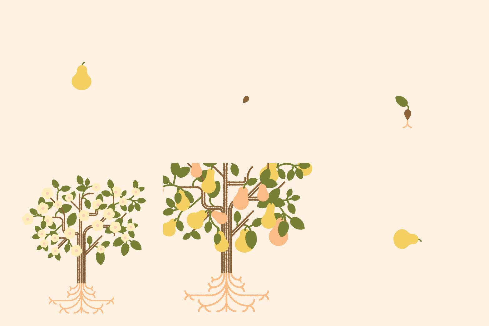
The brand takes its inspiration from the mountain pear: a fruit that sprouts in spring, ripens in summer, is harvested in autumn, and rests through winter. No stage is rushed. No season is skipped. Each one prepares the fruit for the next, and only after this full cycle does the pear become what it was always meant to be.
That same patience shapes everything Limin makes. The name itself carries a second meaning: in Chinese, Limin (黎民) refers to "the people": a nod to the brand's belief that sustainable living shouldn't be reserved for the few. It's a lifestyle meant to be shared, practiced, and passed on.


Packaging Architecture
The packaging system for Limin was designed around two SKUs: a low-alcohol 0.3% and a 5% variant. Each carried through a full, scalable structure: two bottle designs, two individual boxes, two large format boxes holding eight bottles for retail and gifting, and a dedicated gift bag for a more curated, personal presentation. Every format was designed to work as part of one coherent system, so the brand identity holds together whether the product is sold as a single bottle, stacked on a shelf, or gifted as a set.


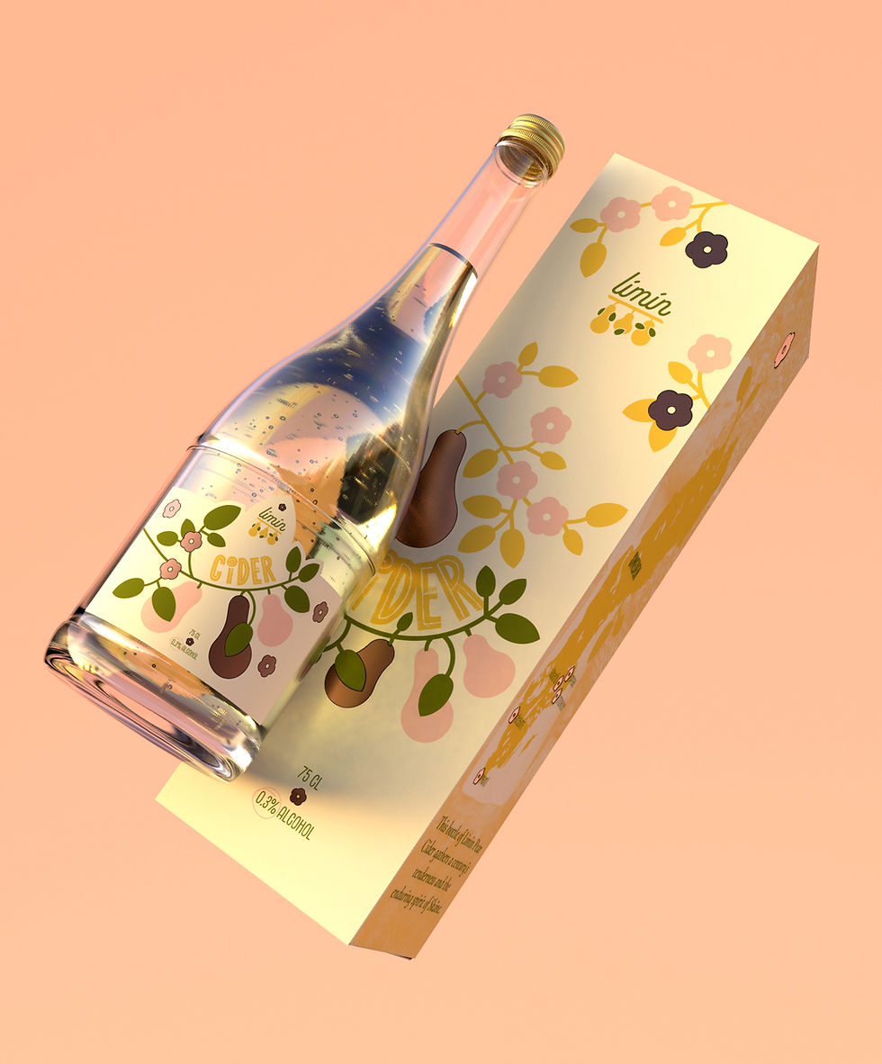


At the center of the packaging sits the pear, as the visual and philosophical core of the brand. Its shape, color, and quiet seasonal symbolism carry through every touchpoint, positioning the pear as the "queen" of the Limin identity: the fruit that only reveals itself after a full, unhurried cycle of growth. This choice extends the brand's core belief that respecting nature's rhythm is inseparable from the product itself. Packaging becomes a small act of responsibility, a reminder that what's inside was never rushed, and shouldn't be either.

Visual Identity
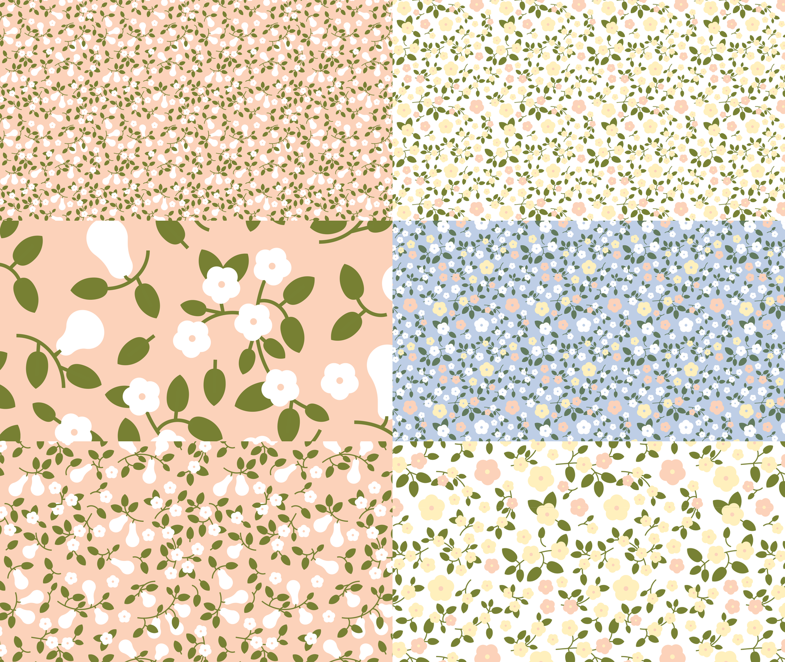
Our color palette tells the same story. Earthy tones reflect the soil's grounding energy, complemented by soft, warm shades of pink and yellow, inspired by flowers and fruit. Green represents vitality and growth, while blue symbolizes the infinite potential of the sky. The patterns, typography, and graphic elements continue this narrative of life, keeping us connected to a positive mindset, one inspired by nature.



At its core, Limin believes that respecting nature and living by its rhythms is the truest form of freedom. Growth, rest, and renewal aren't separate stages to push through; they're the whole point. Limin exists to help people slow down, reconnect with that cycle, and build a life that feels less like a race and more like a season well spent.

